
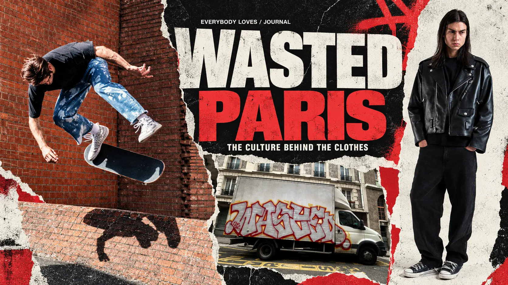
Streetwear has become an easy category to enter. A loose T-shirt, a striking graphic and the right references can quickly establish a familiar look. Building a world that remains interesting across years of collections takes longer.
So, is Wasted Paris a good brand? For us, its strongest argument is the culture behind the clothes: a sustained relationship with skateboarding, music, photography and film, expressed through both the collections and the people involved in making them. Looking through its archive reveals a brand that keeps finding different ways to work with the things it cares about.
That is what makes Wasted worth looking at closely. Beyond a logo or a single season, there is a growing body of work to explore.
The scenes behind the style
Music gives Wasted’s archive much of its structure. It influences the mood of a collection, the choice of collaborators and the way clothes are layered and worn.
FW21/22, *In Bloom*, takes its starting point from Seattle’s grunge scene. The lookbook describes oversized mohair cardigans, checked shirts, layered tops and washed colours. Those choices make sense together: the reference extends through the wardrobe, rather than stopping at a band name on a T-shirt.
The collaboration with Charles Peterson gives that connection a particular weight. His photographs documented the scene around Sub Pop, including Nirvana, Mudhoney and Pearl Jam. Wasted brought those images into a capsule that included clothing and skate decks. There is a direct relationship between the culture being referenced and someone who helped record it.
Kevin Cummins offers another route into that relationship between music and photography. The collaboration documented in Wasted’s brand book draws on his images of British music, including Joy Division, The Smiths and The Stone Roses. Across these projects, the archive becomes something the brand can work with through its original photographers.
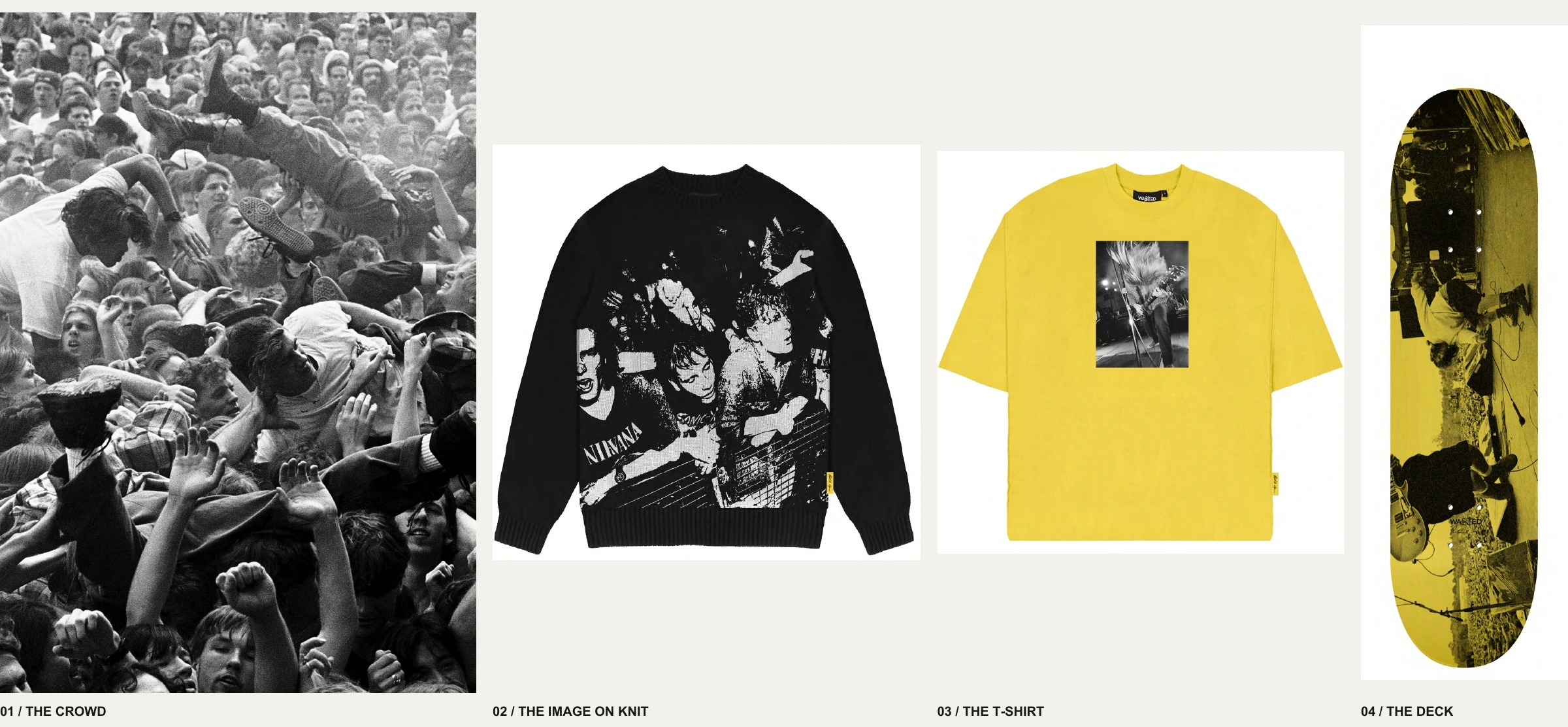
*Charles Peterson’s photographs move between image, garment and skate deck in the FW21/22 capsule.*
The references are in the clothes
Some of the most interesting details sit outside the headline collaborations. Look closely at the graphics and a garment can open a door to a film or a record.
The Another World T-shirt from SS21 carries a cropped frame from *Battle Royale*. The yellow tracksuit, knife and bloodied cheek identify the image even though the film’s title is absent. The reference rewards recognition, while the composition still works as a graphic for someone discovering it for the first time.
Music appears just as directly. The Slave T-shirt from FW21/22 prints a recognisable line from The Verve’s *Bitter Sweet Symphony*. Elsewhere in the same collection, *Dreams Burn Down* shares its distinctive title with Ride’s song, suggesting another connection to British music.
Grave, from SS24, offers a particularly compelling meeting of the two. Its front image strongly matches the beach target-practice sequence in Takeshi Kitano’s *Sonatine*: a gun, a can balanced on a head and the sea behind. Across the back, *Children of the Grave* points towards Black Sabbath. The film connection is a high-confidence visual attribution; the musical reading comes from the printed title, rather than a stated collaboration.
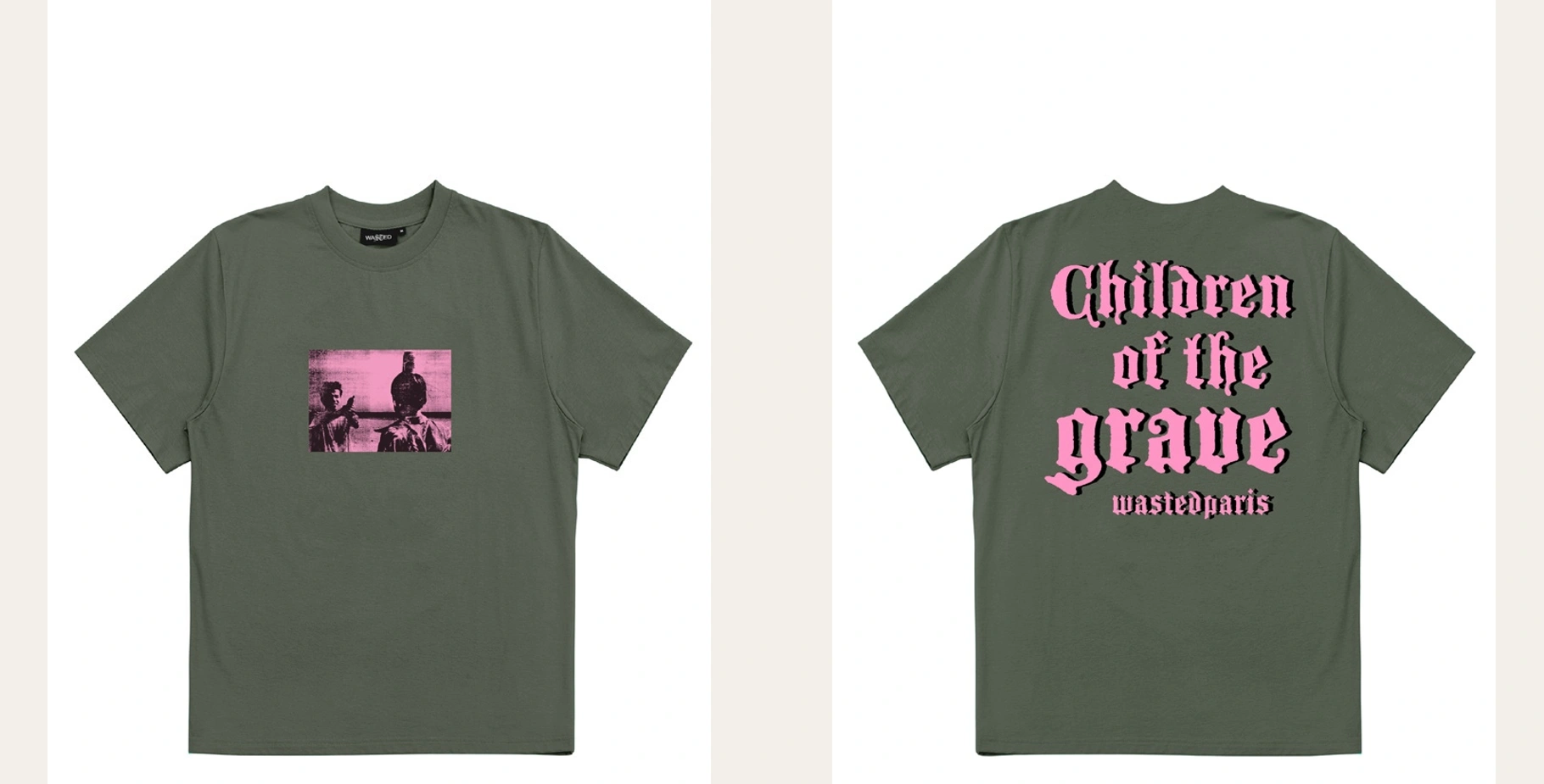
*Grave, SS24: a scene strongly attributed to Sonatine on the front, with a probable Black Sabbath reference on the back.*
Wasted’s own FW22 inspiration notes make other connections explicit. They identify *Kids* in the Pierce graphic and *Ken Park* in Tate and Lust. These are useful examples of how the brand translates its interests into individual pieces, beyond the broader mood of a collection.
Taken together, those details give the clothes another layer. You can appreciate the image first and follow the reference later.
A wardrobe that changes with its influences
Wasted’s cultural continuity does not produce one fixed silhouette. The archive is more interesting because the proportions and materials change with the season’s focus.
After the grunge layering of *In Bloom*, SS22’s *Locals Only* looks towards Dogtown and the Z-Boys. Crochet-knit shirts and polos, natural tones and references to seventies rock build a different wardrobe around Californian skate history.
The brand book then traces SS23’s *From Nowhere* to the overlap between New York skateboarding and hip-hop in the nineties, citing *Kids* and the documentary *All the Streets Are Silent*. FW23’s *Love Lost* moves to Philadelphia’s Love Park, with baggy proportions, camouflage and a mix of punk and hip-hop codes.
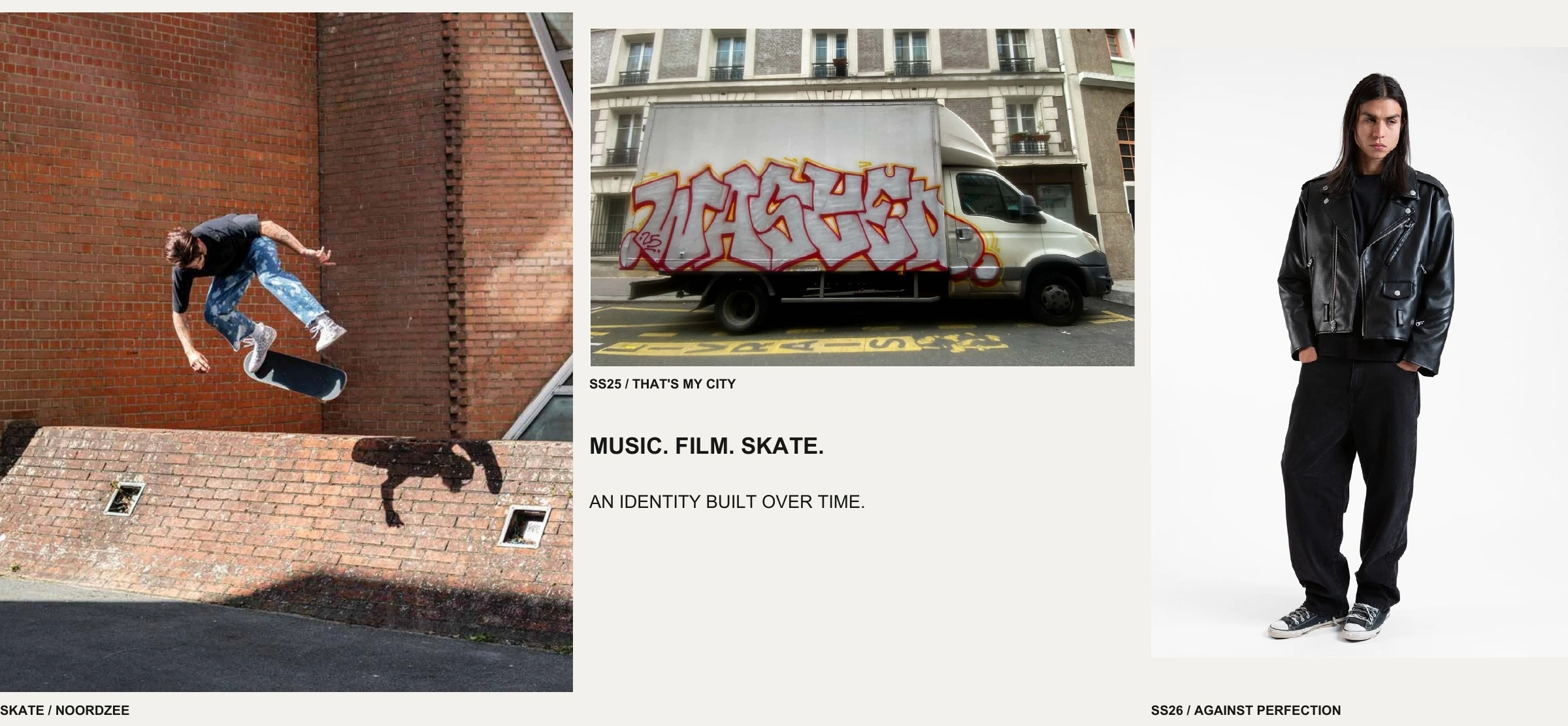
By SS25, *That’s My City* brings skateboarding and football into a French and British street setting, taking inspiration from *Goodbye Charlie Bright*. Mega-baggy jeans and boxy tops carry the collection’s relaxed proportions.
SS26’s *Against Perfection* changes the balance again. Its introduction explicitly pairs fitted tops with loose bottoms and describes denim cuts ranging from cigarette jeans to XL baggies. References include *My Own Private Idaho*, UK punk, grunge and indie sleaze. This is why describing Wasted simply as “oversized streetwear” misses some of what it does: the relationship between pieces matters as much as their individual volume.
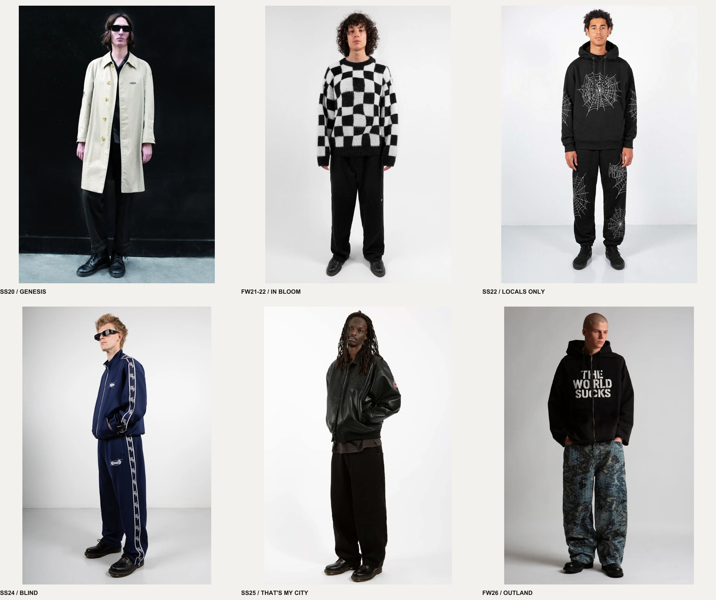
*Selected looks from SS20 to FW26: a changing wardrobe connected by recurring cultural interests.*
FW26’s *Outland* extends the worn surfaces and relaxed proportions into a darker landscape. The lookbook cites *Gummo*, Briscoe Park, *Planet Caravan* and Salem, moving towards abandoned buildings and a threatening rural atmosphere. The change of setting shows how Wasted can carry familiar concerns into a different visual world.
Skateboarding gives the archive a lived context
References alone would tell only part of the story. Wasted’s brand book also documents its skate team, tours and films, including *ERORI*, *Damaged Goods* and *Noordzee*.
Our Journal piece on Wasted Paris’s Fade Away skate video offers another way into that side of the brand.
That activity matters. It places the clothes within an ongoing practice involving people, movement and shared places. Skateboarding provides a context in which the brand’s interest in youth culture continues to develop.
It also helps explain the connections across the archive. Music, film and photography meet through the friendships, tastes and ways of dressing that form around a scene. A brand can draw from several of those sources while maintaining a recognisable point of view.
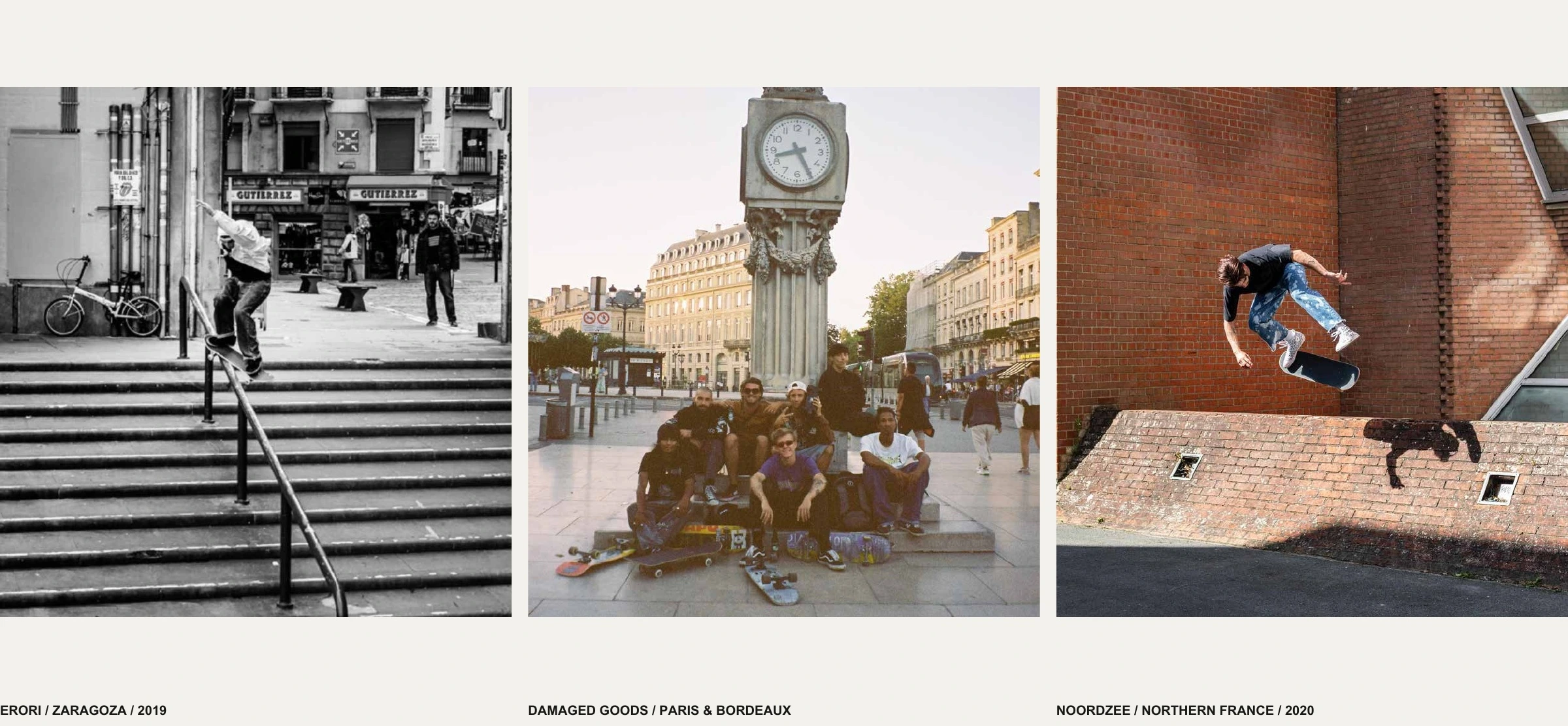
*Images from the brand book’s sections on ERORI, Damaged Goods and Noordzee.*
Why Wasted Paris matters to us
What we value in Wasted is the way that point of view has developed over time. The archive connects specific photographers, films, records and skate scenes to actual garments, then revisits those interests through changing silhouettes and settings.
That gives our answer to “is Wasted Paris a good brand?” its substance. For us, Wasted’s appeal lies in a cultural proposal that becomes richer the closer you look. A cardigan leads to Seattle photography; a T-shirt leads to Japanese cinema; a collection leads to a particular chapter of skate history.
In a crowded streetwear landscape, that depth is a meaningful reason to care about the clothes.
This is also the starting point of our broader look at brands like Wasted Paris : independent labels with a cultural identity of their own.
Leave A Comment