
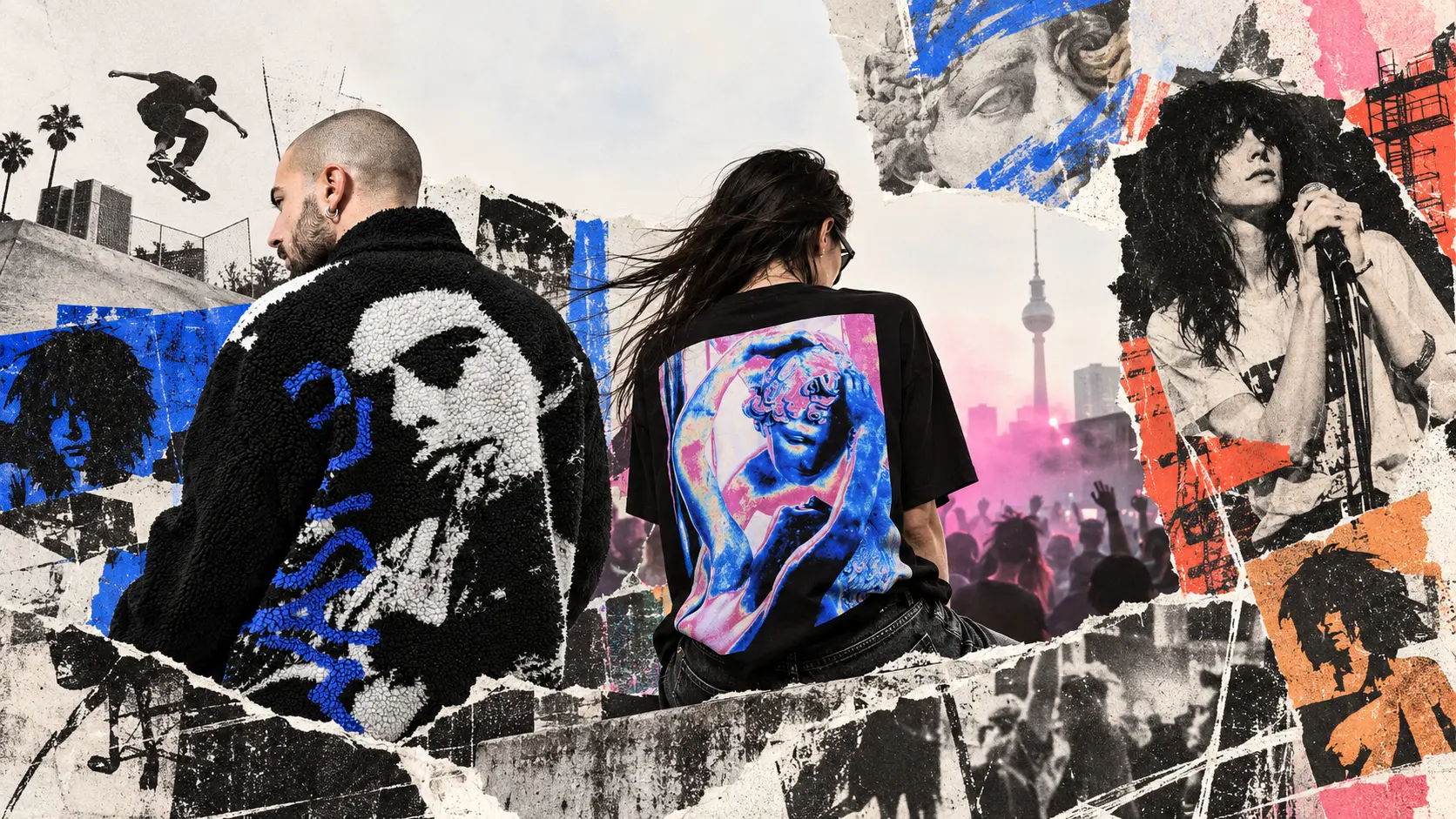
I’ve been around skateboarding and what we now call streetwear since the early 1990s.
Back then, at least for me, streetwear was not a clearly defined category. There was skateboarding, music, shops, magazines, videos, shoes, brands and people sharing references. Everything overlapped.
Even skateboards themselves felt different.
I remember skating older, more directional shapes where the difference between the nose and tail was obvious. Later came the narrower popsicle boards that became normal during the 1990s. Mine was somewhere around 7.7 inches. I couldn’t tell you now if it was 7.70 or 7.75. I remember the feeling better than the number.
Today I look at much wider boards and they seem completely normal.
Things change.
Board shapes change. Trousers get wider, then narrower, then wider again. Shoes disappear and come back. Graphics that once belonged to one particular scene reappear decades later somewhere completely different.
After more than thirty years of watching all of this move backwards and forwards, I have become less interested in trends and much more interested in one question:
Where does a brand come from?
What Do We Actually Mean by “Brands Like Wasted Paris”?
When people search for brands like Wasted Paris, the obvious answer is to make a list of brands that sell similar clothes.
That is not what interests me.
For me, a brand is not “like Wasted Paris” because it uses dark graphics, boxy T-shirts, baggy trousers or a certain type of typography.
That is aesthetics.
And aesthetics can be copied very quickly.
What interests me is everything underneath that.
A brand should feel as if it comes from somewhere. A scene. A city. Music. Skateboarding. Art. Nightlife. A community. Some kind of cultural environment that existed before somebody decided there was a product to sell.
Two brands do not need to look alike to have that in common.
In fact, I would rather they didn’t.
The point is not similarity.
The point is having a point of view.
Wasted Paris: When the Reference Is More Than Decoration
Wasted Paris was one of those brands that immediately made sense within what we wanted Everybody Loves to be.
The connection with skateboarding is obvious, but that was never the only reason. There is music, photography, cinema, graphics and a way of looking at independent culture that feels familiar to me.
I have seen too many aesthetics that began inside real scenes eventually become just another visual trend. The same typography, the same oversized silhouettes, the same references — but with very little behind them.
That is not what interests me.
With Wasted Paris, I can still recognise where some of those references come from.
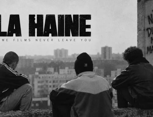
One of the clearest examples is this piece referencing Casper from Kids (1995).
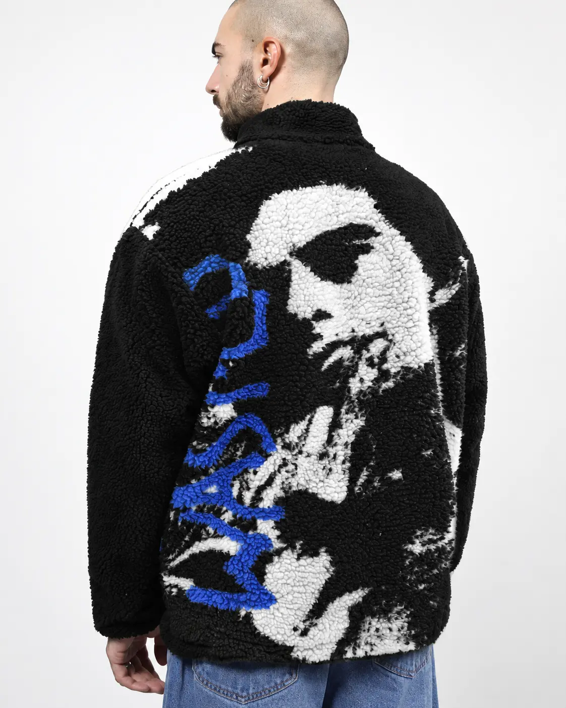
That reference is not just about a film character. It points towards an entire world: skateboarding, 1990s New York, independent cinema, adolescence and a visual language that became inseparable from street culture.
It is not simply a graphic placed on a garment.
It is a reference with a history behind it.
Vertere Berlin: A Different Scene, the Same Principle
Vertere Berlin does not look like Wasted Paris.
And that is exactly why it belongs in this conversation.
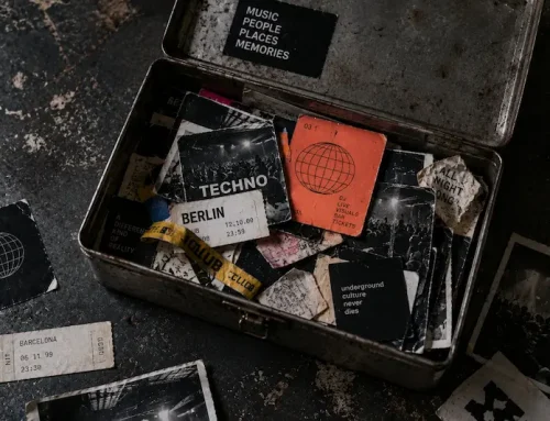
Its starting point is different: Berlin, electronic music, DJs, clubs and nightlife. But the principle underneath feels similar. The culture does not appear to have been added after the clothes were designed. It feels like the place the clothes come from.
That distinction matters to me.
I have been connected to electronic music and club culture for a long time, and I have always seen clothing, flyers, photography, graphic design and music as parts of the same environment rather than separate things.
That is why pieces like Moments of Euphoria make sense in the context of Vertere.
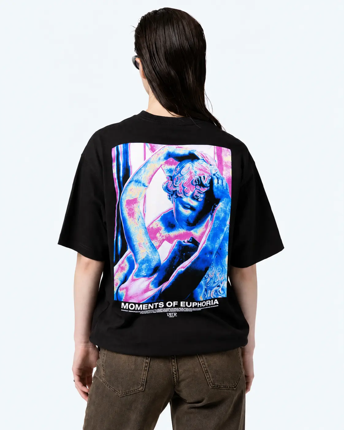
The graphic appears to draw on classical sculpture, but not in a literal or academic way. The figures are layered, distorted and pushed into a visual language built around colour, movement and euphoria.
That becomes more interesting in the context of Vertere’s Hyper Pleasures collection, which explored ideas of passion, desire, intoxication and lust through the experience of Berlin’s dancefloors.
Ancient imagery and contemporary club culture might seem far apart.
Here, they do not.
The reference has been pulled into a different time, a different city and a completely different context.
Deva States: Building a Language of Its Own
Deva States reaches the same idea from somewhere completely different.
The brand began in Indonesia and built its identity around graphics, music, art and references that often sit outside the usual streetwear vocabulary.
That is important to me.
I do not want every brand in a shop to look like the same brand with a different logo. If that happens, something has gone wrong.
Streetwear was never about uniformity. It was about different scenes, different references and different people finding ways to express them.
Deva States has a visual language that feels unmistakably its own.
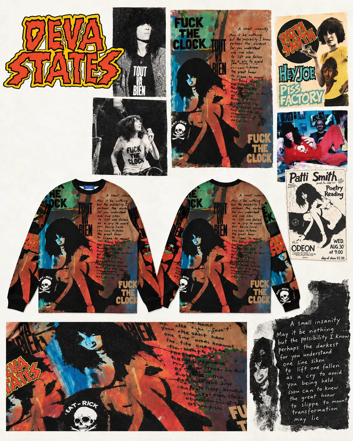
A good example is this piece built around Patti Smith.
The reference goes beyond simply using an image of a musician. Patti Smith represents a point where punk, poetry, photography, writing and independent culture all overlap.
The “Fuck The Clock” imagery, the photographs and the fragmented graphic treatment turn the garment into something closer to a cultural collage than a conventional fashion print.
That is exactly the kind of thing I mean when I talk about wanting to understand why a graphic exists.
It does not just look interesting.
It comes with something behind it.
Streetwear Never Existed in Isolation
For a long time, streetwear was not something you discovered as a category.
It was part of everything else happening around you: skateboarding, music, magazines, shops, clubs, videos, friends. References arrived mixed together, and often you did not even know exactly where they came from.
That meant brands were understood within a context.
You did not only know a T-shirt or a logo. Eventually you understood something about the people behind it, who was wearing it, what music existed around it or which scene had made it visible.
Today we can find a new brand in seconds and know almost everything about it.
That is an enormous advantage.
But it also makes it much easier to separate an aesthetic from the place it originally came from.
Maybe that is why, after all these years, I pay less attention to whether something looks like streetwear and more attention to whether I can understand why it exists.
What We Look for at Everybody Loves
Everybody Loves was never meant to be a shop that tries to carry everything that can fit under the word streetwear.
I would rather have fewer brands that make sense together than a catalogue built simply around volume.
What matters to me is identity.
Culture.
Independence.
A real connection to the things a brand claims to represent.
Wasted Paris, Vertere Berlin and Deva States are not three versions of the same idea.
They should not be.
They come from different places, different scenes and different references.
What connects them is something simpler:
they still seem to come from somewhere.
So What Should You Look for If You Like Wasted Paris?
If you like Wasted Paris, I do not think the answer is to look for the closest copy.
Look at what is behind the clothes.
If skateboarding is part of the story, is that connection real?
If music is part of the identity, does it actually exist beyond the campaign?
If the graphics are full of references, do they come from somewhere, or are they just borrowing the appearance of a culture?
That is what I mean when I think about brands like Wasted Paris.
Not copies.
Not alternatives arranged from number one to number ten.
Brands with their own identity, their own references and a real connection to the culture around them.
After more than thirty years of seeing styles disappear, return and disappear again, one thing still feels clear to me.
The interesting part was never finding the copy.
It was finding what comes next.
Leave A Comment